Oracle Data Visualizations
4 US Design Patents
SnapshotROLE SCOPE OUTCOME STACK | ||
Sole designer embedded in a specialized 10-person engineering R&D team responsible for Oracle's data visualization component library, a specialized subset of Oracle's broader design language.
Over four years, working across Oracle's Skyros and Alta design systems, I designed and shipped four data visualization components that earned four US design patents and were adopted broadly across Oracle's product portfolio.
US Design Patents
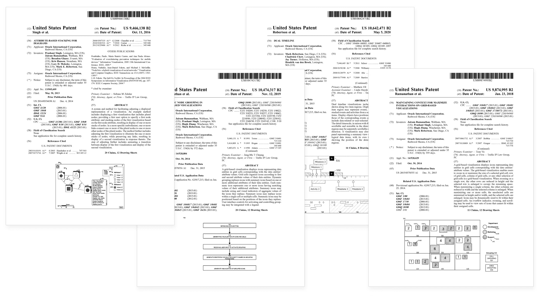
Four US patents, each issued for design innovations I created and shipped in production data visualization components:
US 9,466,138
Attribute-based stacking for diagrams
Component: Diagram
Issued: Oct 11, 2016
> VIEW
US 9,874,995
Maintaining context for maximize interactions on a grid-based visualization
Component: NBox
Issued: Jan 23, 2018
> VIEW
US 10,474,317
Dynamic node grouping in grid-based visualizations
Component: NBox
Issued: Nov 12, 2019
> VIEW
US 10,642,471
Dual Timeline
Component: Dual Timeline
Issued: May 5, 2020
> VIEW
Working on an R&D team
I was the sole designer embedded in a specialized 10-person engineering team, working alongside a Director of Software Development and two lead engineers.
The team operated as a skunkworks-style R&D department, autonomous, well-resourced, and focused on advancing Oracle's data visualization capabilities in response to product team requests.
Product teams submitted component requests. The R&D team triaged, scoped for impact, and either accepted requests as enhancements to existing components, scheduled them for development as new components, or declined them for official design system support.
This role configuration was rare and produced a specific kind of design environment:
High autonomy. No PM intermediaries, no roadmap negotiation. The director, the engineers, and I made design and technical decisions together. No higher level approvals required.
Engineering-first context. Sitting inside an engineering team meant designing with implementation realities front of mind, performance, accessibility, responsiveness, scaling. Every design detail went through rigorous scrutiny and implementation scoping.
Cross-product thinking. Every component had to serve dozens of consumer products inside Oracle. My job was to design for that breadth without compromising depth.
Time & resources to invent. Most product designers don't get a months to think through how a single visualization component should work. I did.
Design system contributor & ambassador
The visualization component library isn't a separate design system. It is a specialized subset of Oracle's broader design language, held to the same standards and patterns as every other component in the system.
That meant I was intimately tied to the design system team as both a contributor and ambassador making it a two-way relationship:
Components I designed had to adhere to the Alta design system's rigid standards (typography, color, spacing, motion, accessibility, interaction conventions)
Patterns I invented for visualization-specific problems were pushed back upstream when they solved needs the parent system hadn't yet addressed.
During my time in this role, I worked across two generations of Oracle's design systems: Skyros, Alta. Most of my visualization component work happened in the Alta era, Diagram, NBox, and Dual Timeline were all designed for Alta.
Dial Gauge was specifically a Skyros-to-Alta modernization, taking an existing component and redesigning it to fit the new design language.
Working at the boundary of two systems on Dial Gauge taught me the discipline of preserving component contracts (functional behavior, accessibility) while evolving visual treatments.
I also served as design system ambassador for product teams across Oracle, helping them understand the visualization library, advising on component selection & options, contributing to system governance discussions, and acting as a bridge between visualization-specific needs and the broader design language.
Diagram
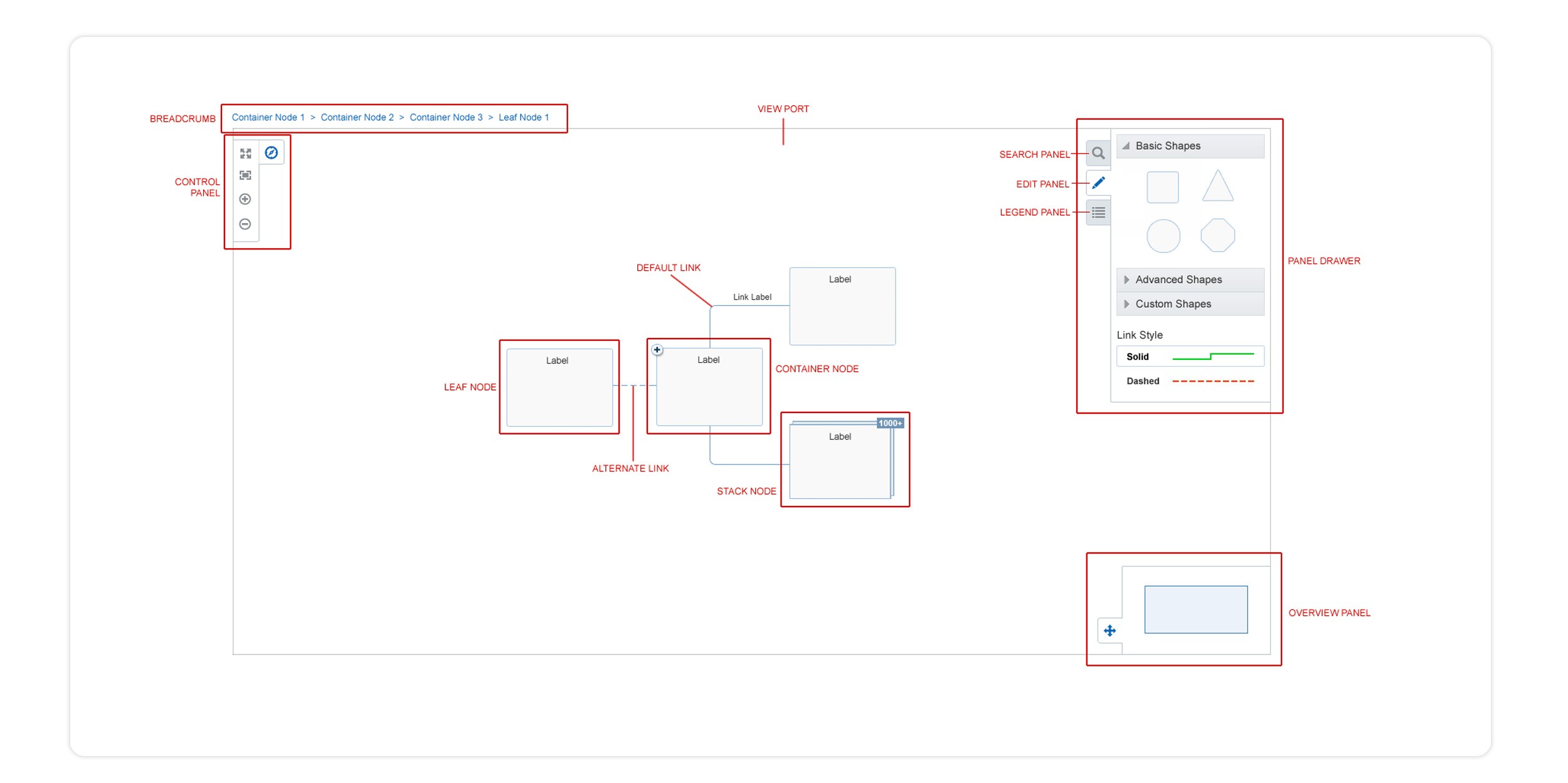
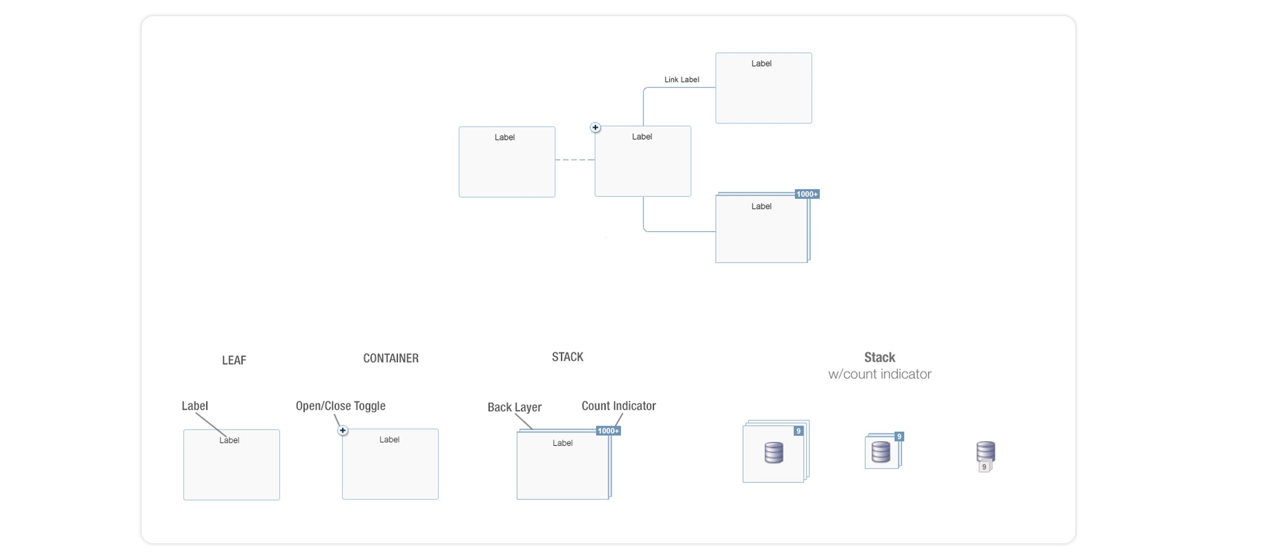
Diagram is one of the most adaptable components in the library, capable of representing any node-and-link visualization, from system architectures to organizational hierarchies to network flows.
I didn't start Diagram. The previous designer had laid the foundational structure before rotating off the project, and I joined to carry the work forward, closing the remaining UX, UI, and interaction gaps so the component could ship.
The gaps that needed solving:
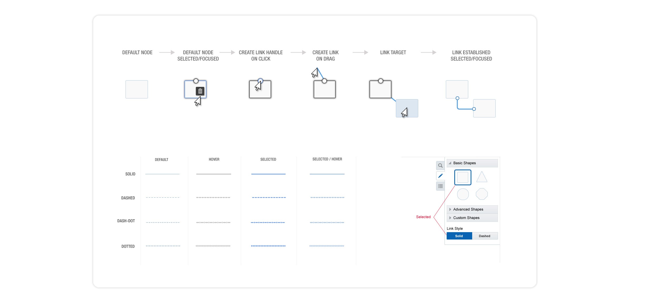
How to display link states & create links, active, hovered, disabled, error, with enough variation to communicate state without visual noise
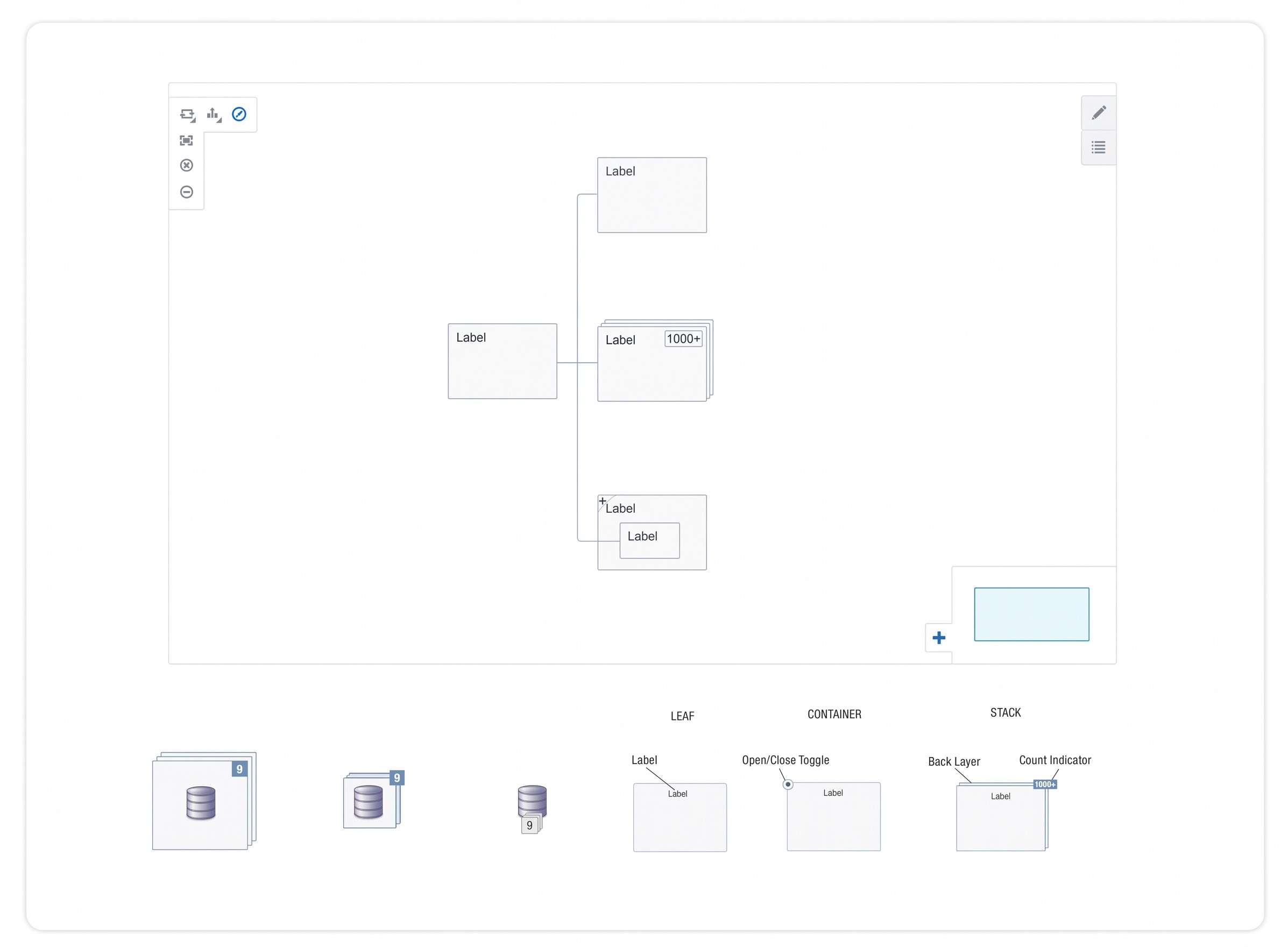
How to group nodes into stacks and collections based on shared attributes
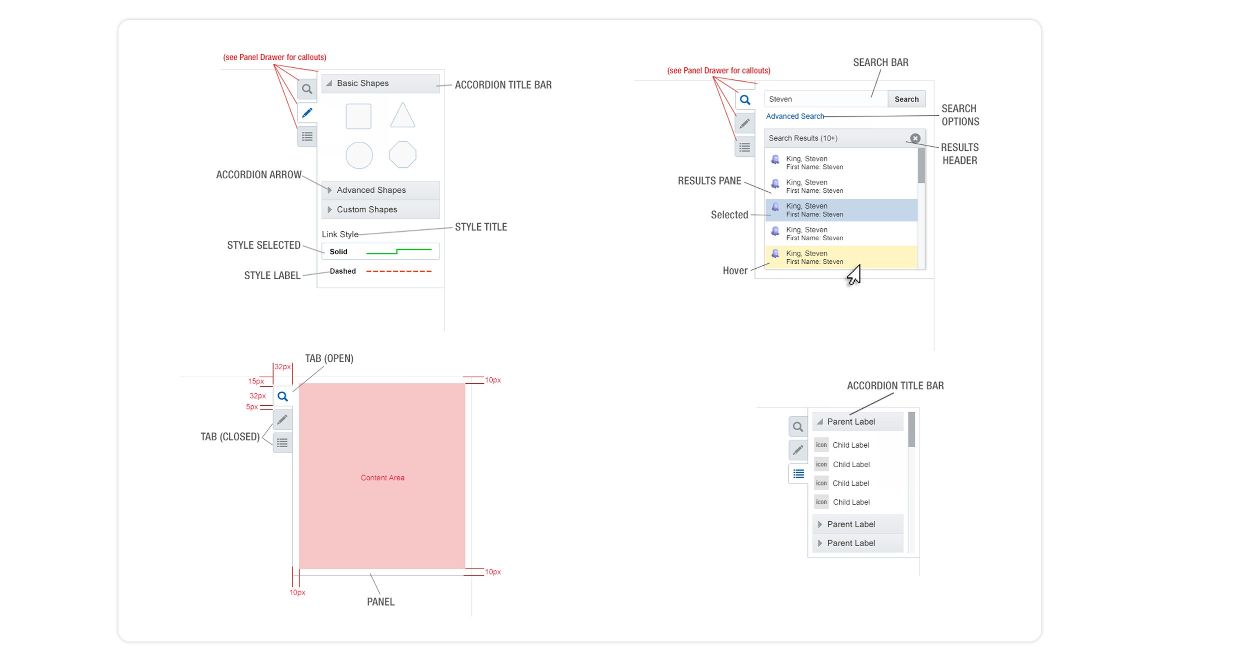
How the legend & search should respond as users toggle between design mode, drilling into nodes, or searching by attributes
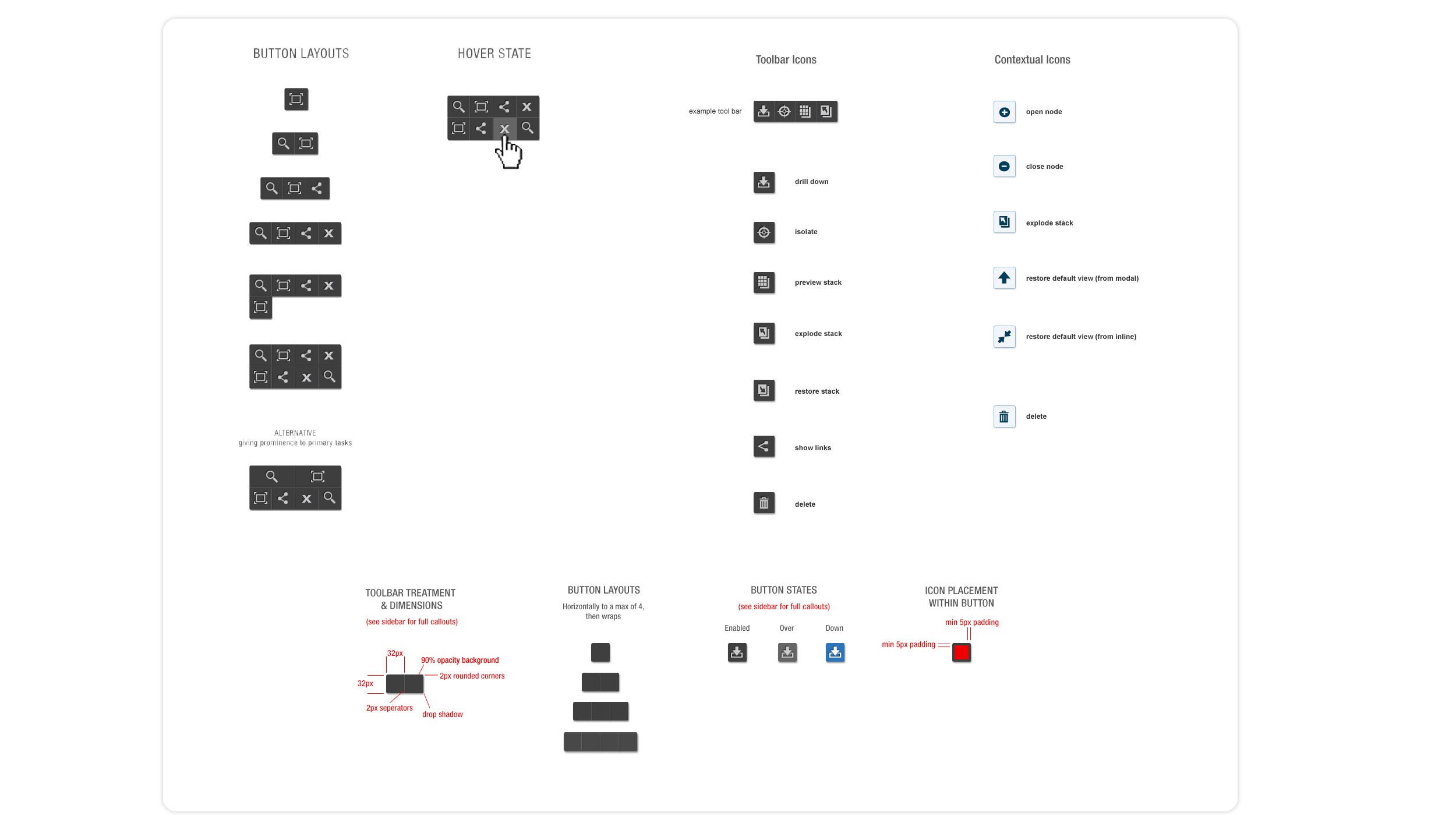
Contextual editor menus, presenting the right tools at the right moment as the user built the diagram, without overwhelming the canvas using a transient tool bar
I implemented a rapid discovery & iteration cycle with the engineering team to close all gaps. Working in low-fidelity prototypes first, validating with internal customers, then committing to high-fidelity.
US Patent 9,466,138
"Attribute-based stacking for diagrams" issued from this work, the design innovation that allowed users to group diagram nodes into visual stacks based on shared attributes, dramatically reducing visual complexity in dense diagrams.
NBox
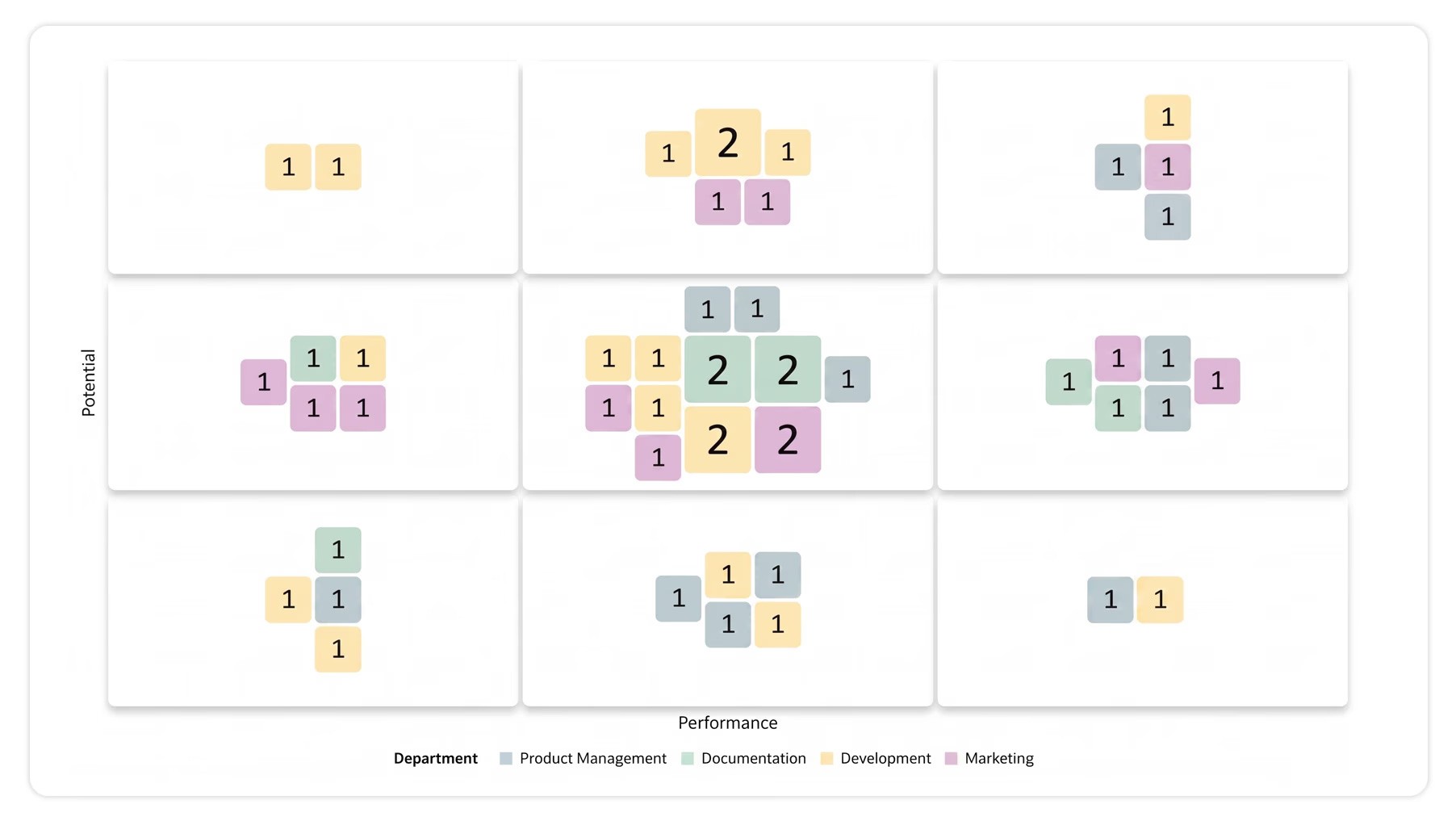
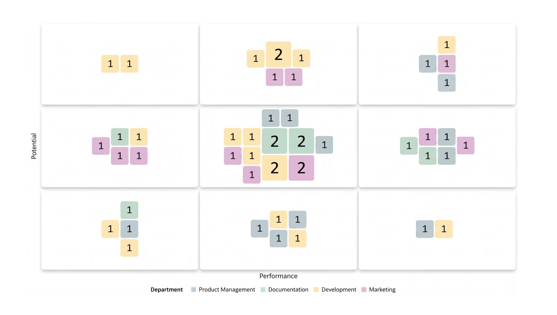
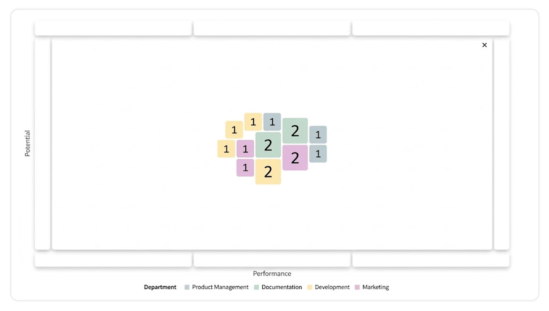
NBox is a grid-based visualization commonly used by HR teams to plot employees on two-axis matrices, performance vs. potential being the canonical use case.
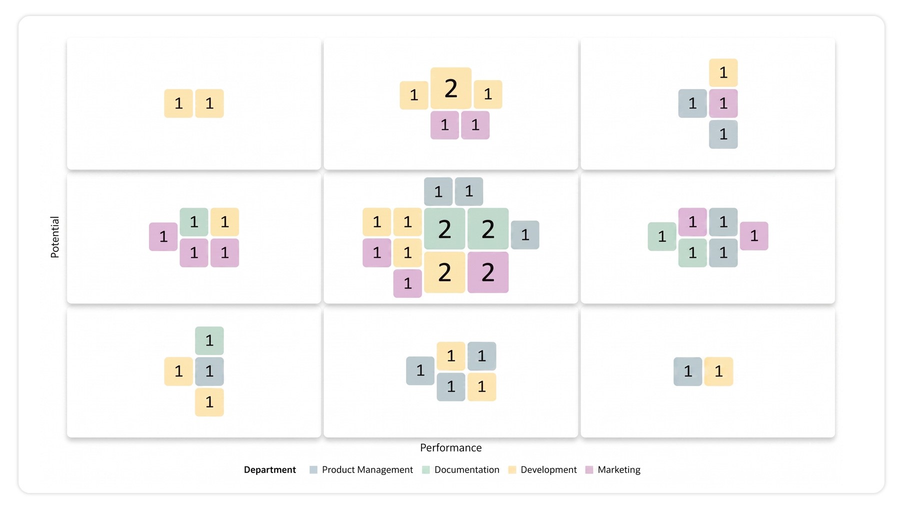
Where NBox differed from earlier grid components is it's ability to group nodes within a quadrant, drill into a quadrant while maintaining context, and toggle between individual node views and aggregated count views based on legend attributes.
Designing for visual depth at quadrant scale
A user needs to see both the high-level distribution (how many people in each quadrant) and the individual data points (which specific employees are where). I drew on fractal design principles and the Gestalt principle of Similarity to communicate both at once:
drill-down depth was conveyed through visual hierarchy
aggregated counts were represented as larger indicators (more nodes = bigger circle), letting users scan the matrix at multiple resolutions simultaneously.
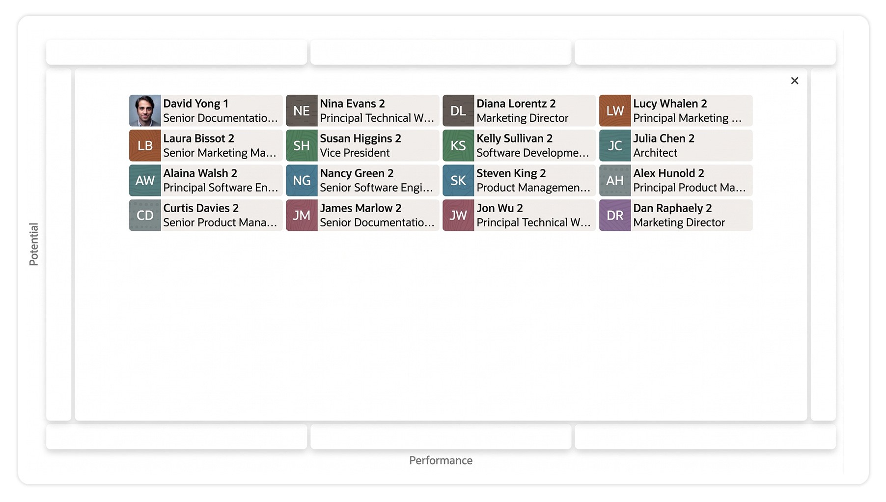
Maintaining context during maximize interactions
When a user clicked a single quadrant to focus on it, the rest of the matrix needed to remain present in some form, so the user wouldn't lose orientation. The patented solution preserved spatial context while expanding the focused quadrant.
Two US patents issued from NBox:
US 9,874,995
"Maintaining context for maximize interactions on a grid-based visualization"
US 10,474,317
"Dynamic node grouping in grid-based visualizations"
Dual Timeline
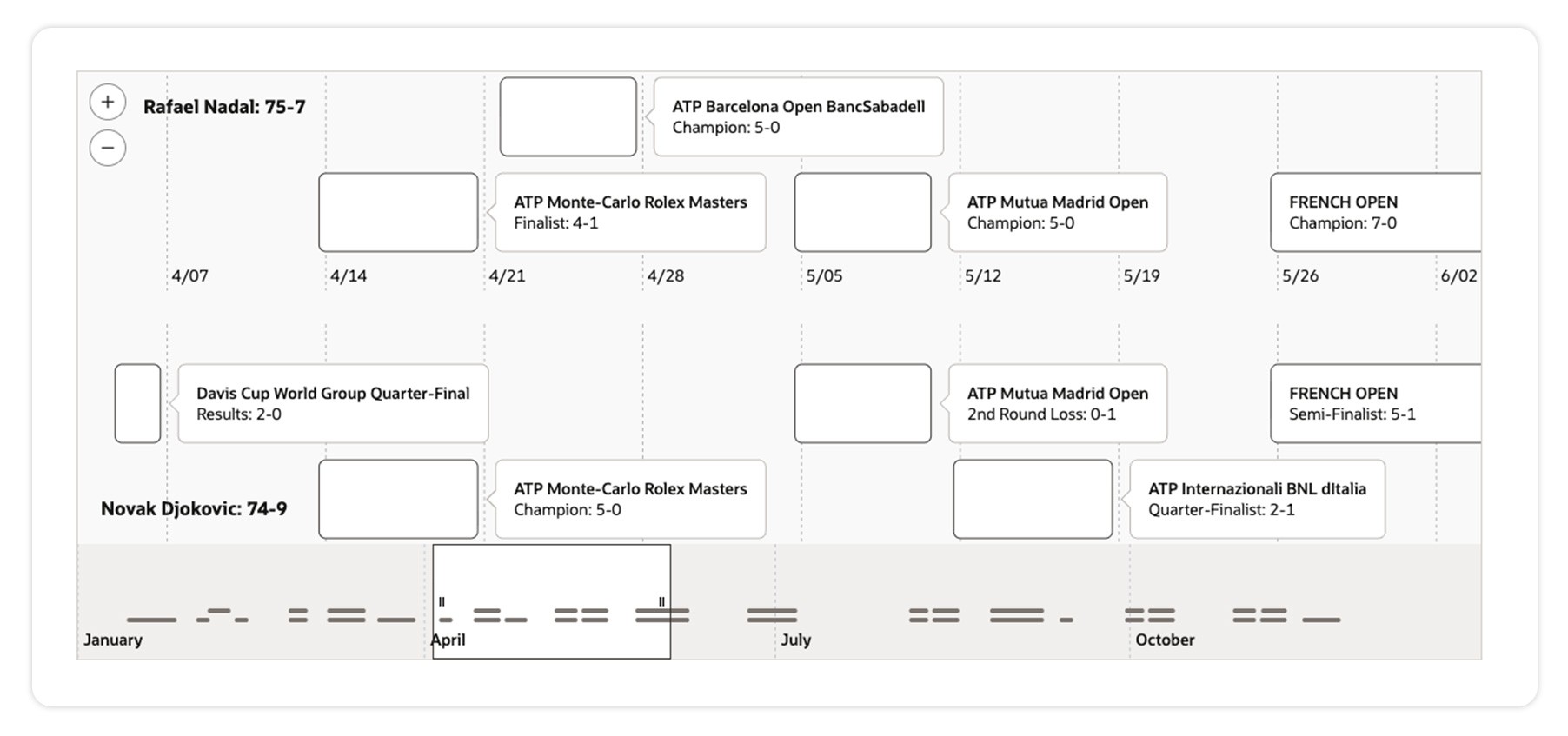
Timeline was already a well-used component in the Oracle ecosystem, used to visualize time-based events on a single data stream. The limitation was that a single stream meant users couldn't compare events across two different sequences in the same time span.
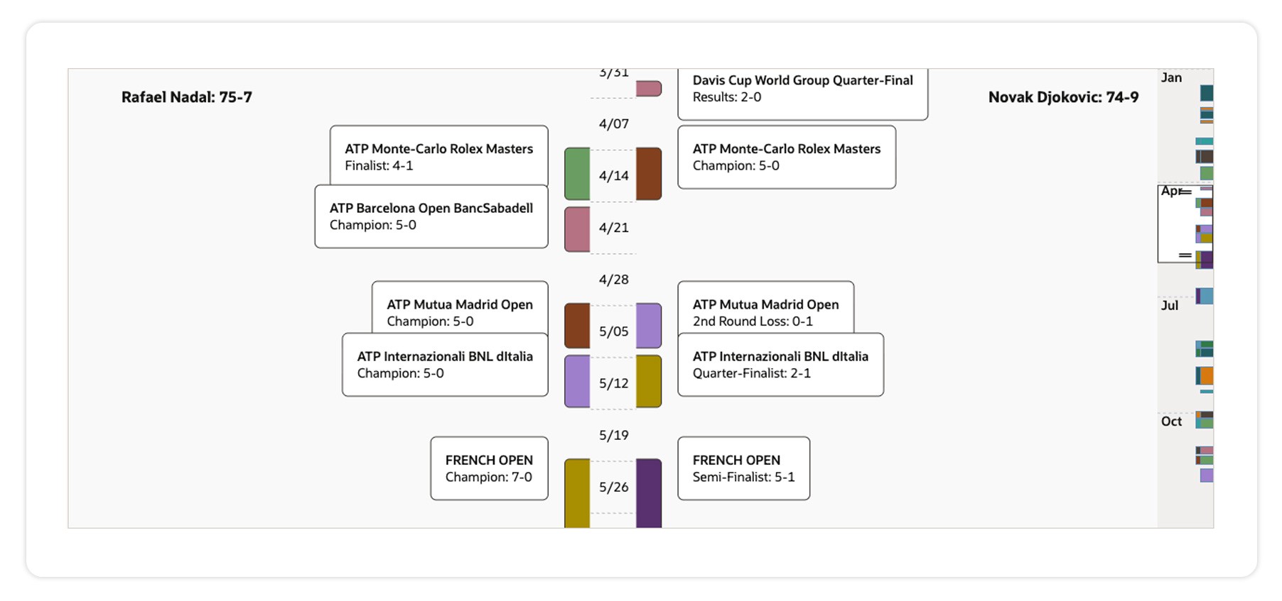
Dual Timeline was the enhancement that solved that. Adding a second, parallel data stream let users do what no timeline component had previously supported, directly compare two event streams over time.
The example use case in the design spec was professional tennis: comparing match attendance and win records between two players over their careers.
The design work focused on three engineering-design intersections:
Component responsiveness across vertical and horizontal orientations, the dual stream had to read coherently regardless of layout
Performance at multiple zoom levels (z-index), users could zoom into a moment in time or zoom out to see decades, the rendering had to stay fluid
Visual differentiation between streams, two streams reading as a coherent comparison, not a confusing overlap
US Patent 10,642,471
"Dual Timeline data visualization"
Dial Gauge
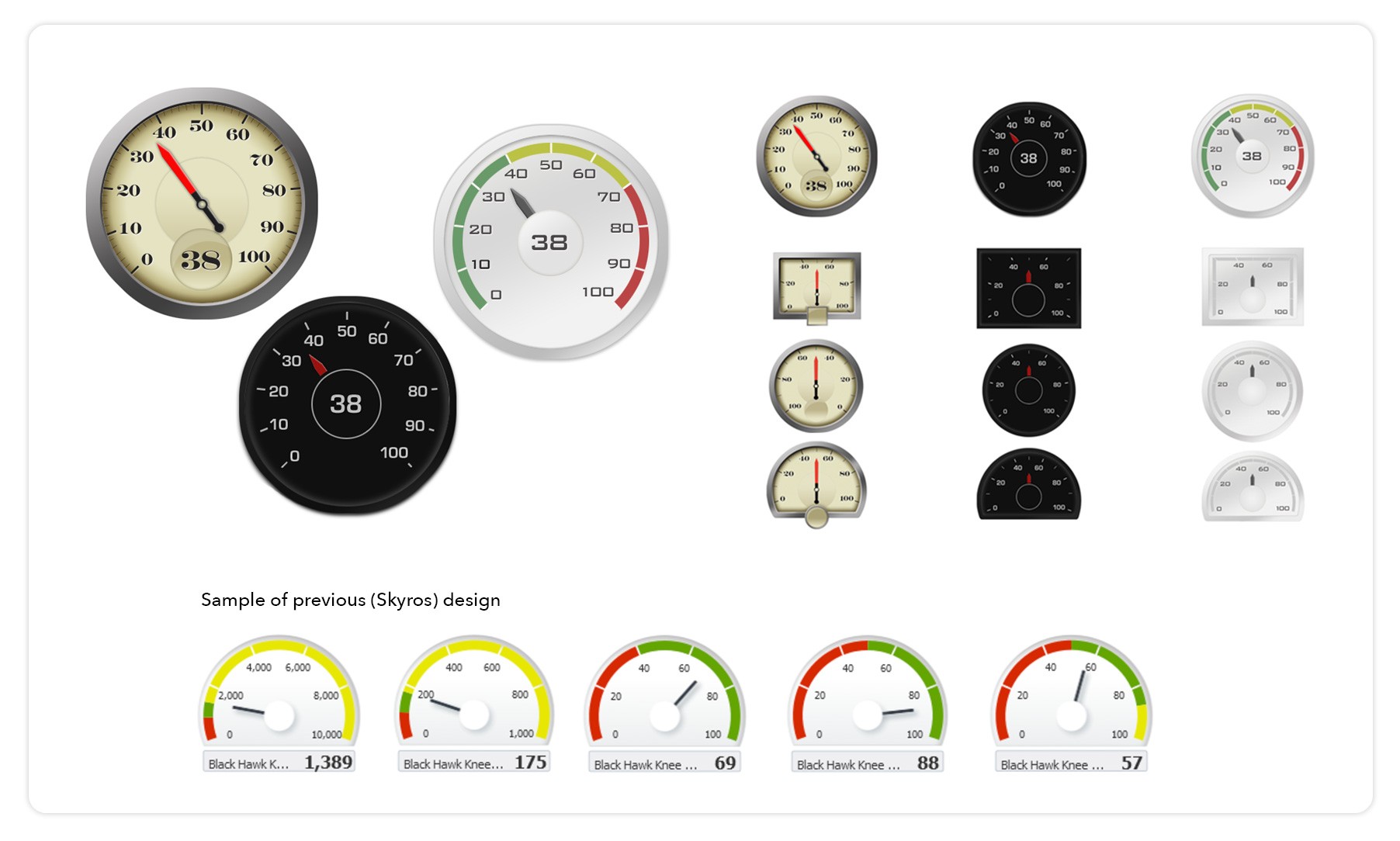
Dial gauges are ubiquitous, both inside Oracle and across modern UIs generally. They measure a single variable visually (like a speedometer). Oracle had an existing Dial Gauge in the older Skyros design system, monochromatic, dated.
The work was to redesign it for the Alta design system while preserving its functional capabilities.
I designed the visual redesign and produced three color themes (light, dark, antique) so users could pick a treatment that fit their respective product interfaces.
Three shape variants, circle, rectangle, and dome, all had to be accounted for in the redesign so product teams had visual flexibility without breaking the component contract.
One additional contribution worth calling out is that I wrote the JavaScript that aligns the gauge needle to tick marks, ensuring precise representational accuracy on every value the gauge could display.
Designers writing production JavaScript on visualization components is rare. And helped me earn respect and building trust within the team.
Why this work matters
Four US design patents in data visualization is rare.
What's rarer is the role configuration that produced them: a sole designer inside an engineering R&D team, with the autonomy, time, and technical understanding to invent at a level most product design environments don't allow.
For a lead product designer in 2026, this case study is the technical-depth credential that complements the AI-native current work.
I've designed components, not just screens
I have legitimate intellectual property in data visualization
I can work inside an engineering team and produce
In 2026 the tools have changed (Sketch and InVision, Figma then…Claude, Gemini and Lovable now).
The component-design discipline, the patent-level rigor, and the engineering-adjacent design instinct, is the same.